HAVEN
BRAND GUIDELINES
CONCEPT
Haven is an app designed for teenagers to have private, one-on-one text conversations with professional therapists. Many teens face challenges like depression, anxiety, and stress but may not feel comfortable discussing them with family or friends. This app provides a safe and confidential space where they can talk to a therapist without fear of judgment. In addition to therapy sessions, Haven also offers simple exercises to help users cope with their emotions in the moment
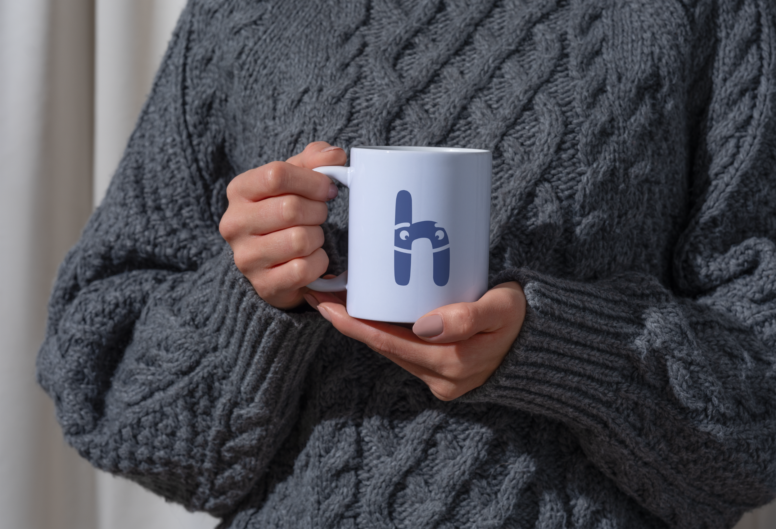
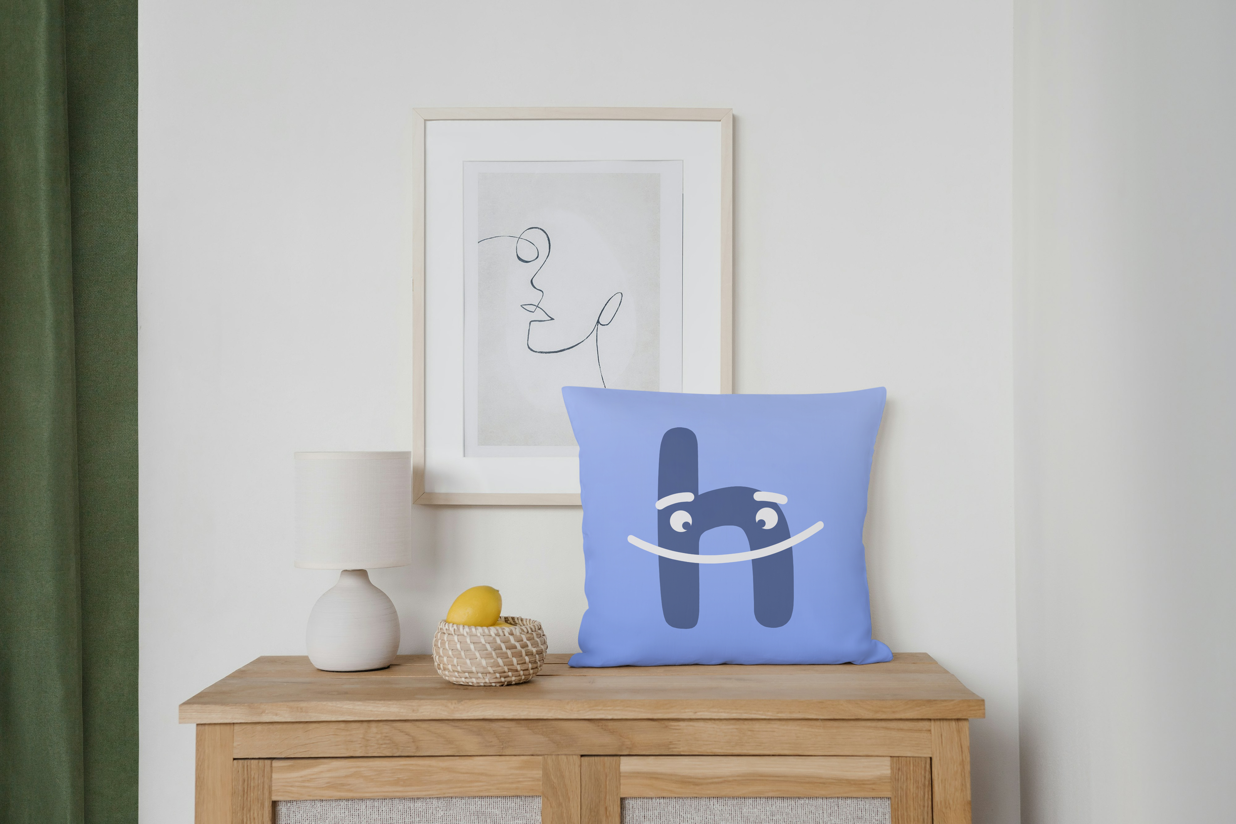
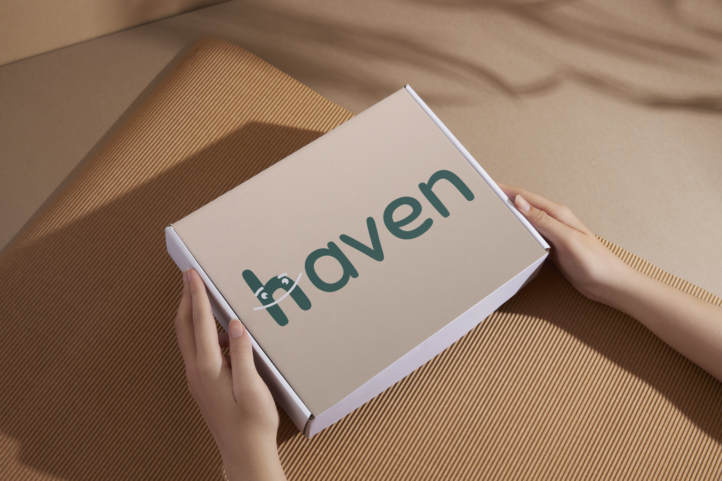
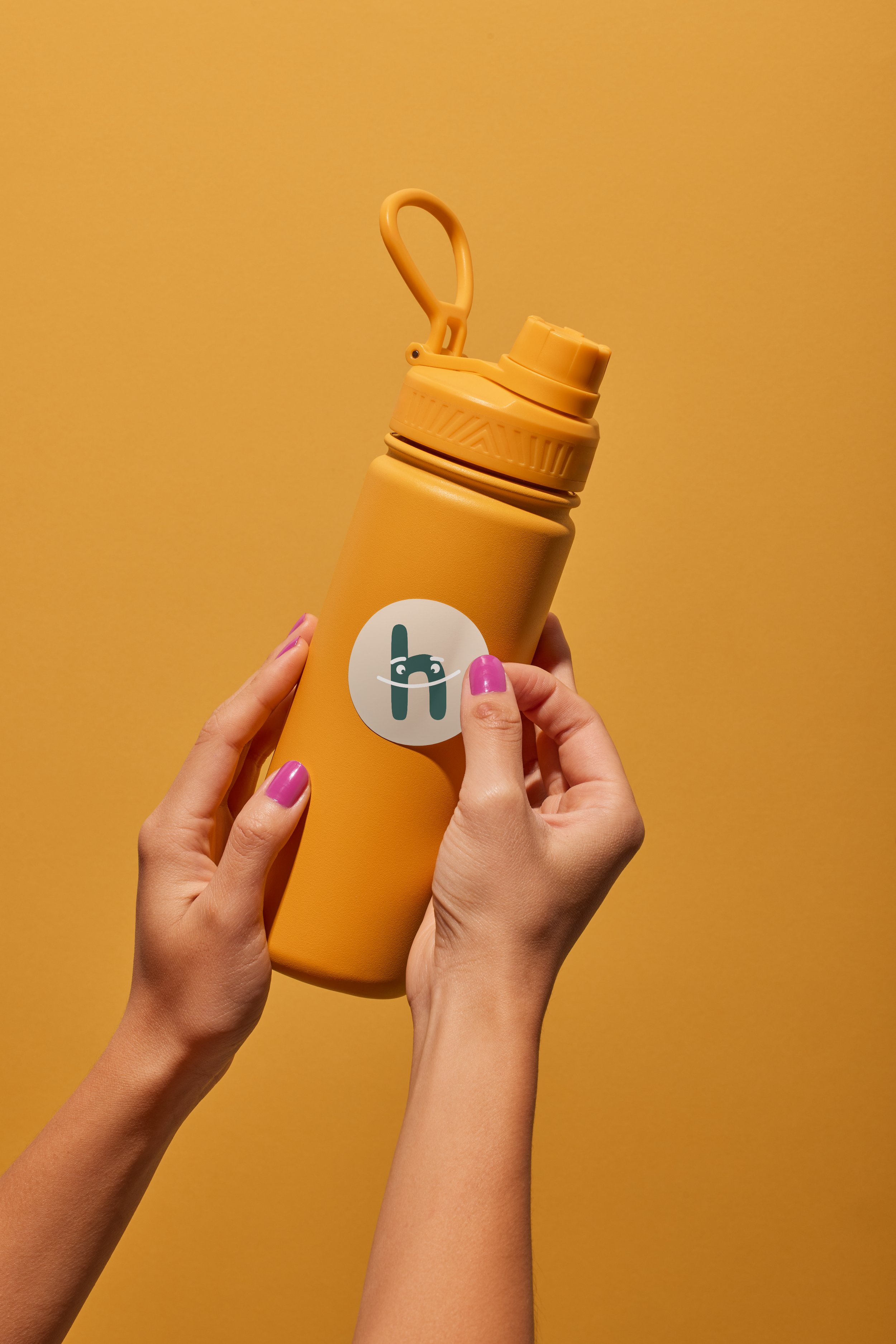
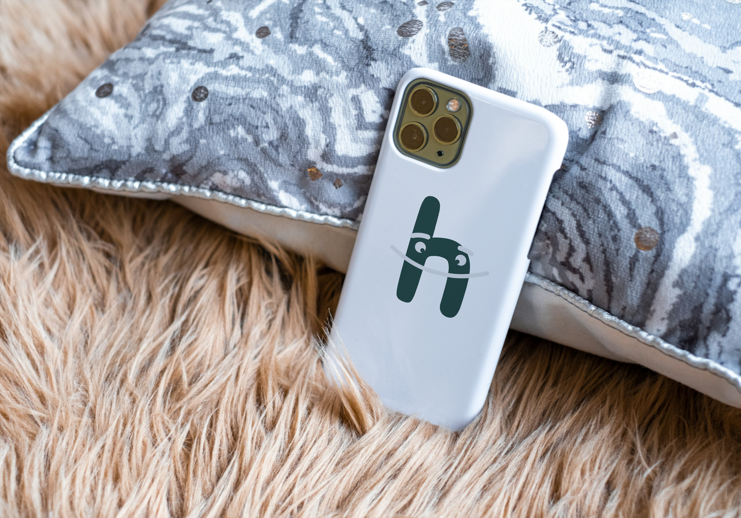
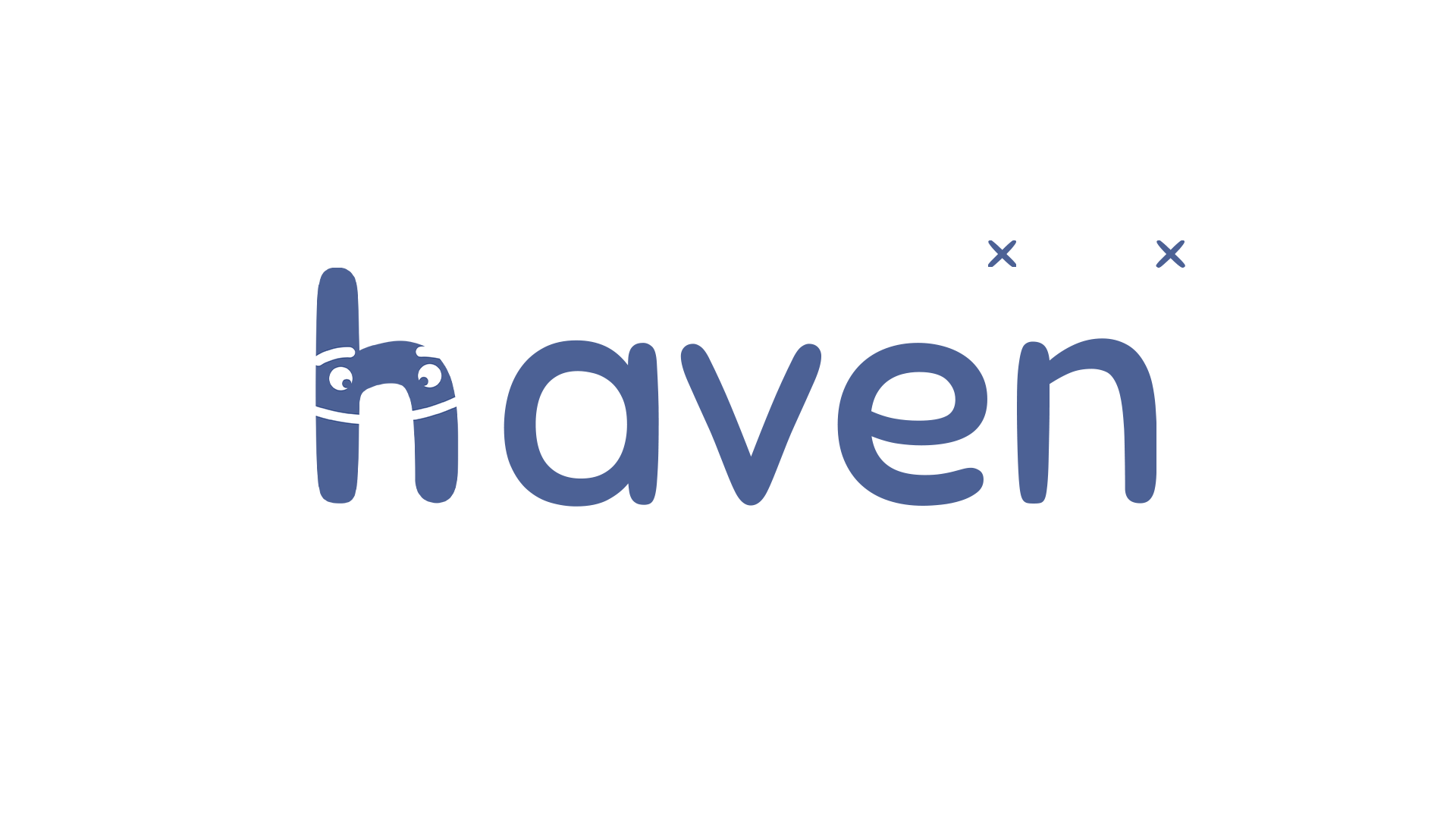
LOGO


TYPOGRAPHY


The Brand Typeface is Sniglet. It is used for the logotype. I only use capitalized letters in this typeface. I chose Sniglet because its soft, rounded design gives the brand a friendly and approachable feel. Its unique letterforms create a sense of warmth and comfort, making the app feel more inviting and supportive for users.
Outfit is the secondary typeface for Haven. It is used for headings and body text. I chose Outfit because its clean, modern, and highly readable design creates a sense of clarity and approachability. Its balanced letterforms ensure a smooth reading experience, making the app feel welcoming and easy to navigate.
COLOR PALETTE
PRIMARY
Mirage - #121723
Kashmir Blue - #4C6195
Malibu - #87A9FF
White - #FFFFFF
SECONDARY
Plantation - #254B45
Indian Khaki - #BCA893
Americano - #89736D
White - #FFFFFF
LOGO SPACE

The logo should never be smaller than 70px in digital and 20mm in print.
The icon should never be smaller than 21px in digital and 6mm in print

LOGO USAGE

It is important that the appearance of the logo remains consistent. The logo should never be misinterpreted, modified or added to. No attempt should be made to alter the logo in any way. It’s orientation, color and composition should remain as indicated in this document - there are no exceptions.

ILLUSTRATIONS
#87A9FF (10% Opacity)
All illustrations have to be set to the color and opacity given on the left.
These illustrations are made by Streamline. It is a Minimal Illustration Pack published on Figma.
streamlinehq.com