Haven
CAMPAIGN DESIGN
PROJECT OVERVIEW
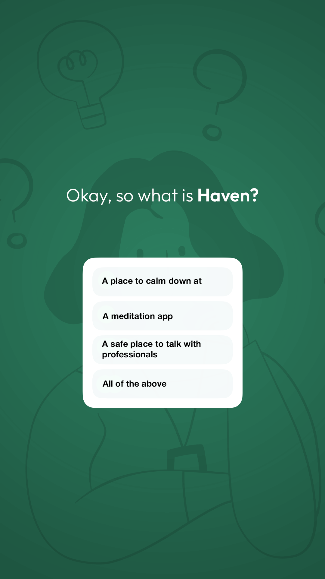
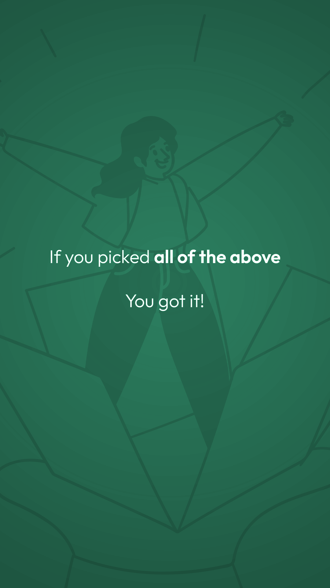
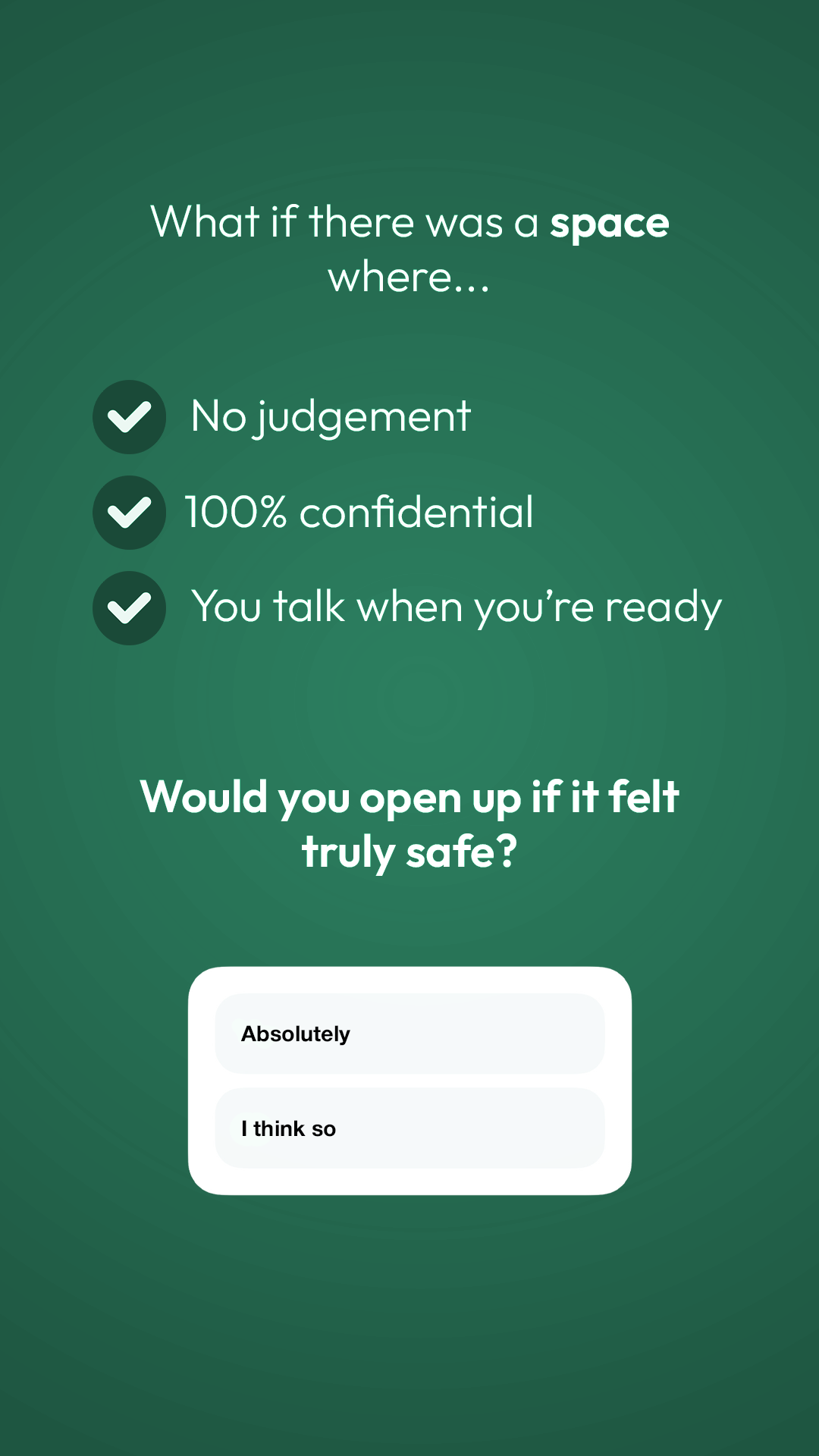
Haven is an app designed for teenagers to have private, one-on-one text conversations with professional therapists. This project is a social media campaign for the Mental Health Awareness Month. The goal of this campaign is to create awareness for teenagers to let them know that there is a place for them. The core concept of this project is having a safe space.
SUSTAINABLE DEVELOPEMENTAL GOAL
This campaign is based on the 3rd SDG - Good Health and Well Being. I chose this SDG and because Haven is very personal to me. I didn’t want others to go through what I did during my teens. I want teenagers to have a safe space to always go to, whenever.


HOW MIGHT WE
How Might We : create awareness
For : teenagers
To : have a safe space where they can have conversations with professionals and meditate.
OBJECTIVE
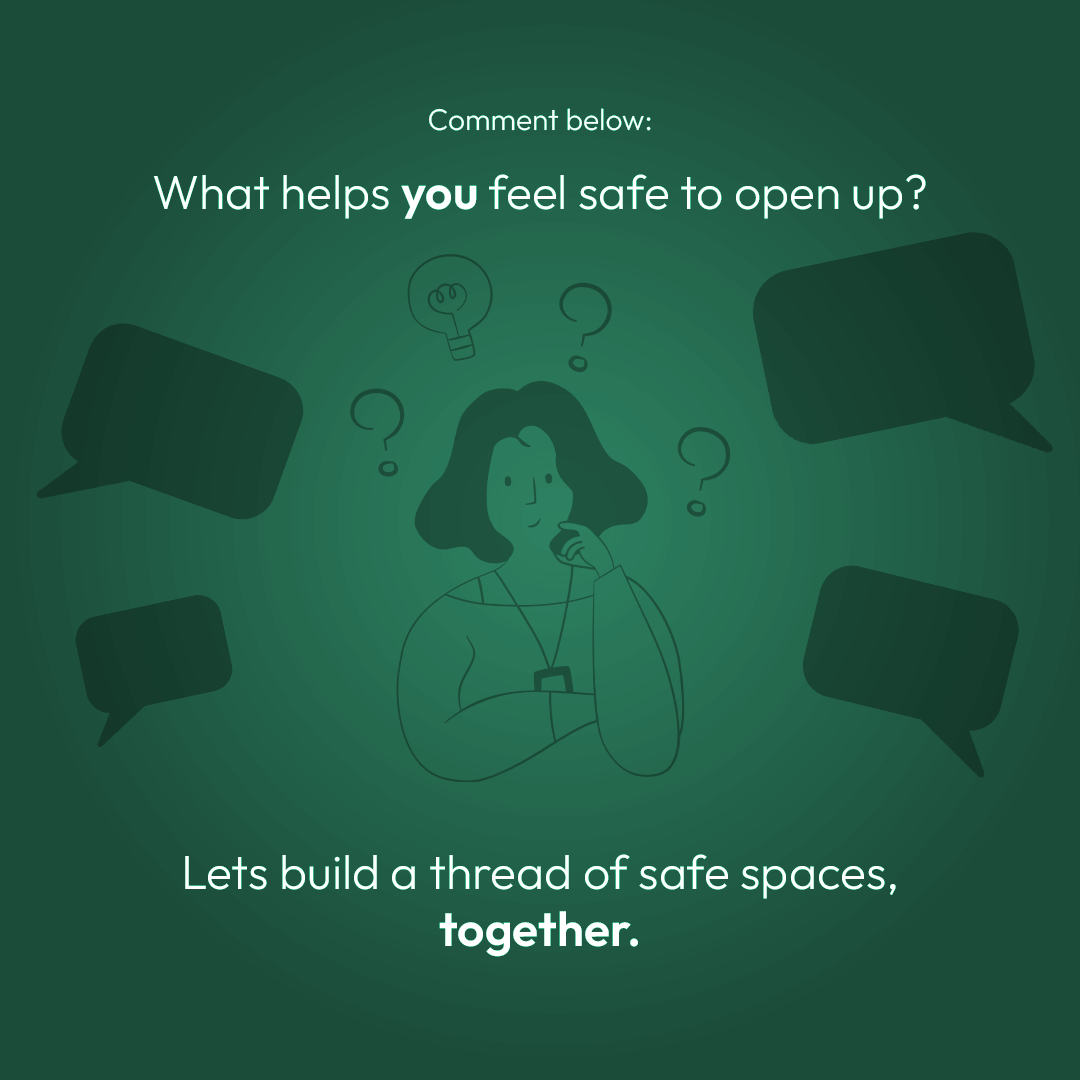
This campaign is about helping teens feel like it’s okay to talk about what they’re going through. We want to make mental health something that feels normal to talk about — not something to hide. By sharing real stories and honest content, we’re reminding young people that they’re not alone. And if they need support, there’s a safe space waiting for them on the Haven app, with professionals who actually care. Mental Health Awareness Month is the perfect time to start these conversations — and keep them going.
COLOR PALETTE
#1A4A38
#256A50
#3AA77E
The color palette for Mental Health Awareness Month is usually more “green” than this, but I chose this color palette because this resonates more with my brand.
#FFFFFF
TYPOGRAPHY
This is the same typography from Haven’s Brand Guidelines.

The Brand Typeface is Sniglet. It is used for the logotype. I only use capitalized letters in this typeface. I chose Sniglet because its soft, rounded design gives the brand a friendly and approachable feel. Its unique letterforms create a sense of warmth and comfort, making the app feel more inviting and supportive for users.

Outfit is the secondary typeface for Haven. It is used for headings and body text. I chose Outfit because its clean, modern, and highly readable design creates a sense of clarity and approachability. Its balanced letterforms ensure a smooth reading experience, making the app feel welcoming and easy to navigate.
Timeline
This campaign will run for a total of 4 weeks.
Week 1
Pre-buzz
Pre-buzz is to make the user aware that there exists a platform for them.
Space
“Space” is to make the user aware of their new space and how they can use it.
You
“You” is about the user. Interacting with the user and getting their response.
Haven
“Haven” is a goodbye to the campaign, yet, also the start of having their own space forever.
Week 4
Week 3
Week 2


POSTS
Week 1 (Pre-buzz)
Posts
This is the first pre-buzz post. It’s not revealing the art-style of the brand, while also hinting that there is something on the way.


Teaser
This will be posted on the last day of the pre-buzz.

Stories
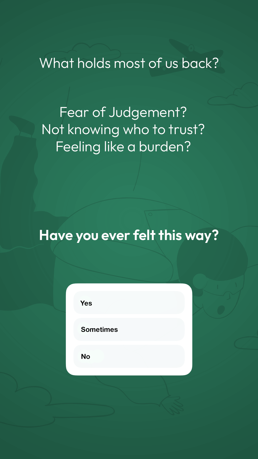
These stories are just to give a teaser and interact.


Reel
A reel to let the user relax.

Week 2 (Space)
Posts
This carousel was to empathize with the users by telling them a story.


Promo
This will be posted on the last day of the 2nd week.

Stories
These stories are just to give a teaser and interact.


Reel
A reel to let the user relax.

Week 3 (You)
Posts
The art-style changes to the brand’s art-style as this is the 3rd week of the campaign. These posts were to engage the user.


Promo
There will be a giveaway hosted on the end of the 3rd week of the campaign.

Stories
These stories are to interact with the user and introduce them to Haven.


Week 4 (Haven)
Posts
The color changes to the final color to wrap up the campaign.


Thank You
An appreciation for the support received during the campaign.

Stories
These stories are just to give a teaser and interact.


ILLUSTRATIONS
#1A4A38 (20% Opacity)
#1A4A38 (10% Opacity)
All illustrations have to be set to the color and opacity given on the left.
These illustrations are made by Streamline. It is a Minimal Illustration Pack published on Figma.
streamlinehq.com